


Navigation Flow
.png)


Brief
Create a UX / UI for user-friendly web interface for an online banking platform that allows users to securely manage their accounts, view statements, make payments, and track their financial activities.
The abundance of information on online banking sites can be distracting and confusing for users, leading to increased anxiety about accidental clicks.
Problem
Possible Solution
Creating a dummy transaction website to ease new users into internet banking. With interactive tutorials, users can practice transactions without risk, reducing their fear of making mistakes. It's a safe way for them to get comfortable with online banking.
Who's it for?
In which bank do you have your back account?
Do you use their net banking/online banking website?
Is it easier to navigate through the website?
What features do you like about the website?
What are the features that you don't like in the website?
Was it easier to navigate the website when you used it first time?
Do you feel anxious about buttons
getting clicked by mistake?
![6156 [Converted]-01.png](https://static.wixstatic.com/media/ce5df7_0a13354a2a01460b8d581c0d4a841b9b~mv2.png/v1/fill/w_980,h_985,al_c,q_90,usm_0.66_1.00_0.01,enc_avif,quality_auto/6156%20%5BConverted%5D-01.png)
EMPATHIZE
User Research
User Interview
Pain Point Analysis
![5597 [Converted]-01.png](https://static.wixstatic.com/media/ce5df7_0e58692d5c2545339bf0e4df8e7b7c26~mv2.png/v1/fill/w_980,h_988,al_c,q_90,usm_0.66_1.00_0.01,enc_avif,quality_auto/5597%20%5BConverted%5D-01.png)
IDEATE
Brainstorming
Conceptualization
Feature List
![5610 [Converted]-01.png](https://static.wixstatic.com/media/ce5df7_52d69366f0644fbda0bf460c1ac45609~mv2.png/v1/fill/w_980,h_934,al_c,q_90,usm_0.66_1.00_0.01,enc_avif,quality_auto/5610%20%5BConverted%5D-01.png)
PROTOTYPE
Paper Wireframes
Navigation Flow
Information Architecture
Mid/High Fidelity
![5899 [Converted]-01.png](https://static.wixstatic.com/media/ce5df7_d7a06b7ded5342b483c023e4538361b9~mv2.png/v1/fill/w_980,h_982,al_c,q_90,usm_0.66_1.00_0.01,enc_avif,quality_auto/5899%20%5BConverted%5D-01.png)
DEFINE
User Persona
User Journey
Empathy Map
Empathize
Interview Questions
This dummy transaction website is designed for newcomers to internet banking, offering a risk-free environment for learning. With interactive tutorials and practice transactions devoid of real money, it targets users looking to gain confidence and familiarity with online banking without fear of mistakes.
Process
ICICI
Cons -
-
Service Charges
-
Account Maintenance Requirements
-
Complex Products
-
Quality of Service
-
Privacy and Security Concerns
Pros -
-
Extensive Network
-
Wide Range of Products and Services
-
Innovative Services
-
International Presence
-
Customer Support
Pros -
-
Extensive Network
-
Overseas banking
-
Rapid growth
-
First bank to launch International Debit card in association with VISA security
Cons -
-
Limited free transactions
-
Low branches but moderate ATM centers
-
Account Minimum Balances
-
Credit Card Approval
-
Branch Queues
-
Interest Rates
HDFC
Pros -
-
Large Network across India
-
Diverse services
-
Well-established reputation
-
Competitive Interest Rates
-
Government Backing
SBI
Cons -
-
Slow Customer service
-
High fees for some services
-
Limited International presence
-
Outdated technology
-
Limited product offering
-
Interest rate fluctuations
Competitive Analysis
~ Complex Navigation
~ Performance Issues (Slow loading and unresponsive pages)
~ Limited mobile optimization
~ Login and authentication
~ Transaction Errors
~ Lack of clarity in Interface
~ Data security and concerns
SBI
~ Occasional Technical glitches
~ Complex registration
~ Frequent Updates
~ Mobile App compatibility
ICICI
~ Complex Registration
~ Limited self- service options
~ Less responsive user support and customer service Issues locating specific features
~ Mobile App has lack of certain features compared to the web platform
HDFC
Pains
User Persona
01

About
Likes
Dislikes
Pains
Parag Subhedar
Registrar (Govt Employee)
Age - 56
Profession - Registrar
Working Hours - 8
It’s easy to log-in and log-out.
Alert on screens while taking any action.
Automatic password reset after 3 months for security purposes.
Navigation system.
No clarification of functions.
Time consuming to search each function.
Has fear of buttons ‘if clicked any button by mistake the money would be gone.
Too complicated interface.
Difficulty finding desired functions.
Adding amount to beneficiaries or FDs is a time consuming process.
Fear of too many buttons
02

About
Likes
Dislikes
Pains
Yatindra Indapawar
Financial Consultant
Age - 54
Profession - Financial Consultant
Working Hours - 8
Easy to log-in and log-out.
Overall interface in terms of colors and placement.
Navigation system.
Functions are easy to access but there’s too much information.
Frequent updates should be notified to the user.
Too much unnecessary information and ads.
Frequent updates.
Confusing Interface.
User Journeys
SBI User
Opens website
Log in button
Finds the function to add money to FD
Clicks on it
Goes through the procedure
Confirm transfer Alert pops
Gives Confirmation
Procedure complete
ICICI User
Opens website
Personal
Interested in opening savings account
Selects category
Redirect to different page
Notifications (to allow/deny)
Compulsory to allow
Goes back
Empathy Map
Says
Thinks
Okay lets go to Fixed Deposit category but I don’t know where it is.
I got it!
Okay, let’s complete the transfer now.
My money is transferring now.
I have to add amount to my Fixed Deposit.
Lets search it/ watch tutorial video.
Lets fill up the needed information.
Lets confirm the Alert to transfer the amount.
Does
Opens website
Takes time to search/watch the video.
Takes time to fill the information/ gather required documents.
Confirms the alert.
Feels
Confused
Clear
Hopeful
Satisfied
Ideate
To enhance navigation efficiency, the implementation of tab-based functionality, allowing users to directly select specific functions upon logging in.
In the event of a user's initial login, the implementation of pop-up options, such as the voice assistant feature, can significantly enhance the ease of navigation.
How might we?
For first-time users during the login process, the inclusion of pop-up options, such as a user guide feature, can facilitate seamless navigation.
The functions should be arranged in a way that is neither too scattered nor overly complicated.
User Journeys
First Time User
Daily User
Opens website
Opens website
Log in option
Log in
pop-up voice assistant feature
Tab based functionality
Selects allow option
Selects category
Voice assistant helps navigate
Reads the guide
Open savings/current account
Fills the required documents
Procedure to fill required documents
Completes the procedure according to the guide
Completes the procedure
Automatic log-out pop-up while closing the tab
Log out
Logged- out
Empathy Map
Says
Does
I want to open a new savings account.
Lets start the process according to the voice assistant.
Lets fill all the required information and documents.
Okay, lets confirm the Alert.
Opens website
Starts the process by filling information.
Starts choosing categories according to the assistant.
Gives information.
Thinks
Feels
I don’t know how to complete the procedure. I will enable voice assistant to help me navigate.
I have gathered all the important documents.
The process is almost done.
The process is completed!
Hopeful
Clear
A bit nervous
Satisfied
Site Map

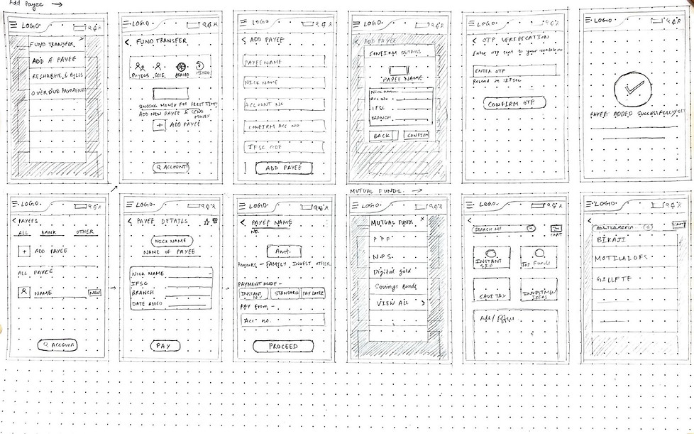
Prototype
Wireframes


Design System & Component Library
Color Guide
Primary
Robin Egg Blue
#32D6D8
Space Cadet
#202046
Grays
Silver
#BABABA
Onyx
#3A3B3A
Jet
#2D2E2D
Secondary
#E9F4FC
Alice Blue
French Grey
#C5C5CF
Indication
#3532D8
Palatinate Blue
Red
#FF0000
Typography
Font - Inter Family
H1
H2
H3
H4
H5


Inter Semi Bold Italic size- 36
Inter Medium size- 22
Inter Regular size- 18
Inter Regular size- 16
Inter Thin size- 14
Inter Thin size- 12
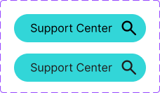
Buttons


Components
LOGO
Widgets
Header & Footer
Copyright mark


Buttons


Iconography

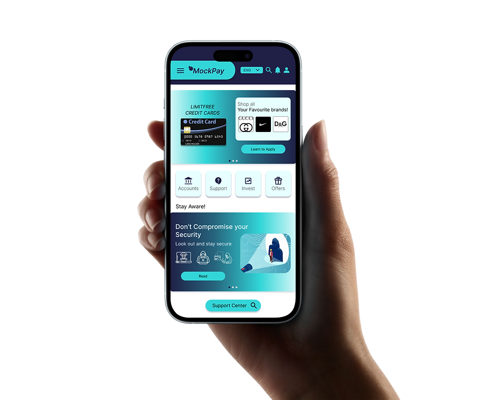
High Fidelity UI
Admin Screens


Onboarding


Dashboard

Overlays


Task Flow

Task Flow and USP Final Prototype
